CSS的宽度为100%的输入框超出了父元素的边界。
CSS的宽度为100%的输入框超出了父元素的边界。
我正在尝试创建一个带有两个带有插入填充的输入字段的登录表单,但它们最终超出了父级的限制。这是什么原因?
JSFiddle代码片段:http://jsfiddle.net/4x2KP/
    #mainContainer {
        line-height: 20px;
        font-family: "Helvetica Neue",Helvetica,Arial,sans-serif;
        background-color: rgba(0,50,94,0.2);
        margin: 20px auto;
        display: table;
        -moz-border-radius: 15px;
        border-style: solid;
        border-color: rgb(40, 40, 40);
        border-radius: 2px 5px 2px 5px / 5px 2px 5px 2px;
        border-radius: 2px;
        border-radius: 2px 5px / 5px;
        box-shadow: 0 5px 10px 5px rgba(0,0,0,0.2);
    }
    .loginForm {
        width: 320px;
        height: 250px;
        padding: 10px 15px 25px 15px;
        overflow: hidden;
    }
    .login-fields > .login-bottom input#login-button_normal {
        float: right;
        padding: 2px 25px;
        cursor: pointer;
        margin-left: 10px;
    }
    .login-fields > .login-bottom input#login-remember {
        float: left;
        margin-right: 3px;
    }
    .spacer {
        padding-bottom: 10px;
    }
    /* ELEMENT OF INTEREST HERE! */
    input[type=text],
    input[type=password] {
        width: 100%;
        height: 20px;
        padding: 5px 10px;
        background-color: rgb(215, 215, 215);
        line-height: 20px;
        font-size: 12px;
        color: rgb(136, 136, 136);
        border-radius: 2px 2px 2px 2px;
        border: 1px solid rgb(114, 114, 114);
        box-shadow: 0 1px 0 rgba(24, 24, 24,0.1);
    }
    input[type=text]:hover,
    input[type=password]:hover,
    label:hover ~ input[type=text],
    label:hover ~ input[type=password] {
        background:rgb(242, 242, 242) !important;
    }
    input[type=submit]:hover {
      box-shadow:
        inset 0 1px 0 rgba(255,255,255,0.3),
        inset 0 -10px 10px rgba(255,255,255,0.1);
    }
admin 更改状态以发布 2023年5月22日
根据CSS基本盒模型,元素的宽度和高度应用于其内容框。内边距在内容框之外,增加了元素的整体大小。
因此,如果您将带有内边距的元素设置为100%的宽度,则其内边距将使其比其包含元素的100%更宽。在您的情况下,输入框变得比其父级更宽。
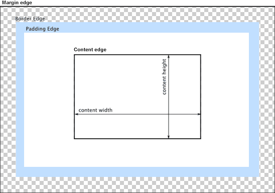
您可以更改盒模型处理内边距和宽度的方式。将CSS属性box-sizing设置为border-box,以防止内边距影响元素的宽度或高度:
border-box:宽度和高度属性包括内边距和边框,但不包括外边距...请注意,内边距和边框将在框内部。
请注意box-sizing的浏览器兼容性(IE8+)。
在此编辑时,不需要任何前缀。
Paul Irish和Chris Coyier建议使用下面的“继承”用法:
html {
  box-sizing: border-box;
}
*, *:before, *:after {
  box-sizing: inherit;
}
参考资料,请参见:
* { Box-sizing: Border-box } FTW
继承 box-sizing 可能是更好的最佳实践。
以下是在您特定语境中的演示:
#mainContainer {
  line-height: 20px;
  font-family: "Helvetica Neue", Helvetica, Arial, sans-serif;
  background-color: rgba(0, 50, 94, 0.2);
  margin: 20px auto;
  display: table;
  -moz-border-radius: 15px;
  border-style: solid;
  border-color: rgb(40, 40, 40);
  border-radius: 2px 5px 2px 5px / 5px 2px 5px 2px;
  border-radius: 2px;
  border-radius: 2px 5px / 5px;
  box-shadow: 0 5px 10px 5px rgba(0, 0, 0, 0.2);
}
.loginForm {
  width: 320px;
  height: 250px;
  padding: 10px 15px 25px 15px;
  overflow: hidden;
}
.login-fields > .login-bottom input#login-button_normal {
  float: right;
  padding: 2px 25px;
  cursor: pointer;
  margin-left: 10px;
}
.login-fields > .login-bottom input#login-remember {
  float: left;
  margin-right: 3px;
}
.spacer {
  padding-bottom: 10px;
}
input[type=text],
input[type=password] {
  width: 100%;
  height: 30px;
  padding: 5px 10px;
  background-color: rgb(215, 215, 215);
  line-height: 20px;
  font-size: 12px;
  color: rgb(136, 136, 136);
  border-radius: 2px 2px 2px 2px;
  border: 1px solid rgb(114, 114, 114);
  box-shadow: 0 1px 0 rgba(24, 24, 24, 0.1);
  box-sizing: border-box;
}
input[type=text]:hover,
input[type=password]:hover,
label:hover ~ input[type=text],
label:hover ~ input[type=password] {
  background: rgb(242, 242, 242);
  !important;
}
input[type=submit]:hover {
  box-shadow: inset 0 1px 0 rgba(255, 255, 255, 0.3), inset 0 -10px 10px rgba(255, 255, 255, 0.1);
}
.login-top {
  height: auto;/*85px;*/
}
.login-bottom {
  padding: 35px 15px 0 0;
}
或者,而不是将填充添加到元素本身,请为包装输入的元素设置样式。这样,元素可以设置为width:100%,而不会受到任何额外的填充影响。以下是示例:
#login-form {
  font-family: "Helvetica Neue", Helvetica, Arial, sans-serif;
  background-color: rgba(0, 50, 94, 0.2);
  margin: 20px auto;
  padding: 10px 15px 25px 15px;
  border: 4px solid rgb(40, 40, 40);
  box-shadow: 0 5px 10px 5px rgba(0, 0, 0, 0.2);
  border-radius: 2px;
  width: 320px;
}
label span {
  display: block;
  padding: .3em 1em;
  background-color: rgb(215, 215, 215);
  border-radius: .25em;
  border: 1px solid rgb(114, 114, 114);
  box-shadow: 0 1px 0 rgba(24, 24, 24, 0.1);
  margin: 0 0 1em;
}
label span:hover {
  background: rgb(242, 242, 242);
  box-shadow: inset 0 1px 0 rgba(255, 255, 255, 0.3), inset 0 -10px 10px rgba(255, 255, 255, 0.1);
}
input[type=text],
input[type=password] {
  background: none;
  border: none;
  width: 100%;
  height: 2em;
  line-height: 2em;
  font-size: 12px;
  color: rgb(136, 136, 136);
  outline: none;
}
.login-bottom {
  margin: 2em 1em 0 0;
}
input#login-button {
  float: right;
  padding: 2px 25px;
}
input#login-remember {
  float: left;
  margin-right: 3px;
}